Versions Compared
| Version | Old Version 1 | New Version Current |
|---|---|---|
| Changes made by | ||
| Saved on |
Key
- This line was added.
- This line was removed.
- Formatting was changed.
Logos
Primary & secondary logos
Our primary logo is the most important messenger of our brand. Always use this logo when possible. When it’s not possible to use our primary logos, such as when the logo is placed on a dark background, use our secondary logo. We only use our monochrome logo when only one colour is allowed.
Using our primary logo
The logos consist of two primary elements, the word image “SVEA” and the line underneath it. We never separate these two elements. Also, the size of the logo should not be exaggerated.
The Primary logo is best used on light backgrounds.
Primary logo
 Image Modified
Secondary logo
 Image Modified
Monochrome logo - rare cases
 Image Modified
 Image Modified
Logo clear space – digital media
The clear space is a fundamental rule used to ensure that the sender Svea is always perceived in the clearest way possible.
The clear space of the logo is the relative dimensions in which no other elements may be placed.
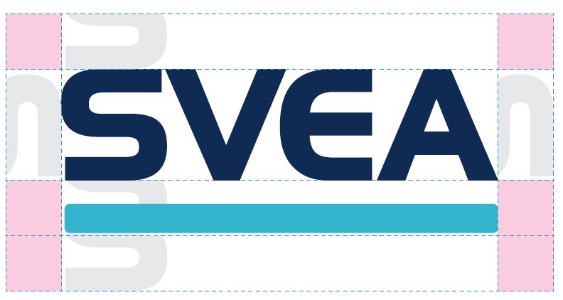 Image Modified
Using our logo with other companies logos
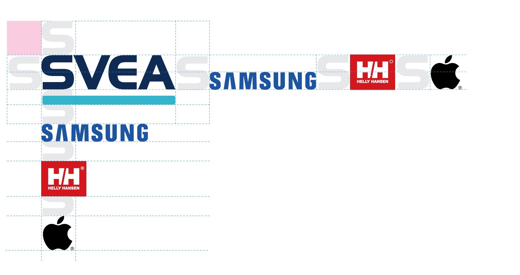 Image Modified
Colours
Our colours can be divided into five categories.
Brand colour: The colour that should always be synonymous with the brand Svea. The brand colour isn’t necessarily the one used the most, but the one that should always stand out the most.
Complementary colour: This colour should support the brand colour by adding contrast.
Background colours: Colours used on paper and empty, digital spaces that allow the content to breathe.
Text colours: Colours that first and foremost are used on texts, such as this one.
Supporting colours: The background singers of the colour palette. They never take place at the center of the stage but can be used to bring depth and harmony to our brand.
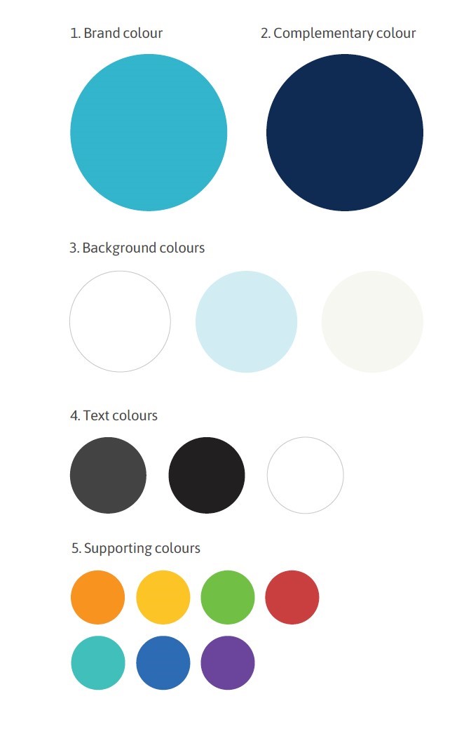 Image Modified
Our brand colour – Svea Turquoise – makes us stand out among our competitors and helps us get recognized by our customers. It’s a strong colour rooted in our core values. The complementary colour – the Svea Dark Blue – is used to give a warm contrast to the sharp turquoise.
The text colour has a softer black tone that makes it warmer and more pleasant to look at. Always assume the graphite black as our primary text colour, but adjust as you see fit depending on medium and usage. Check out our digital style guide to get more information.
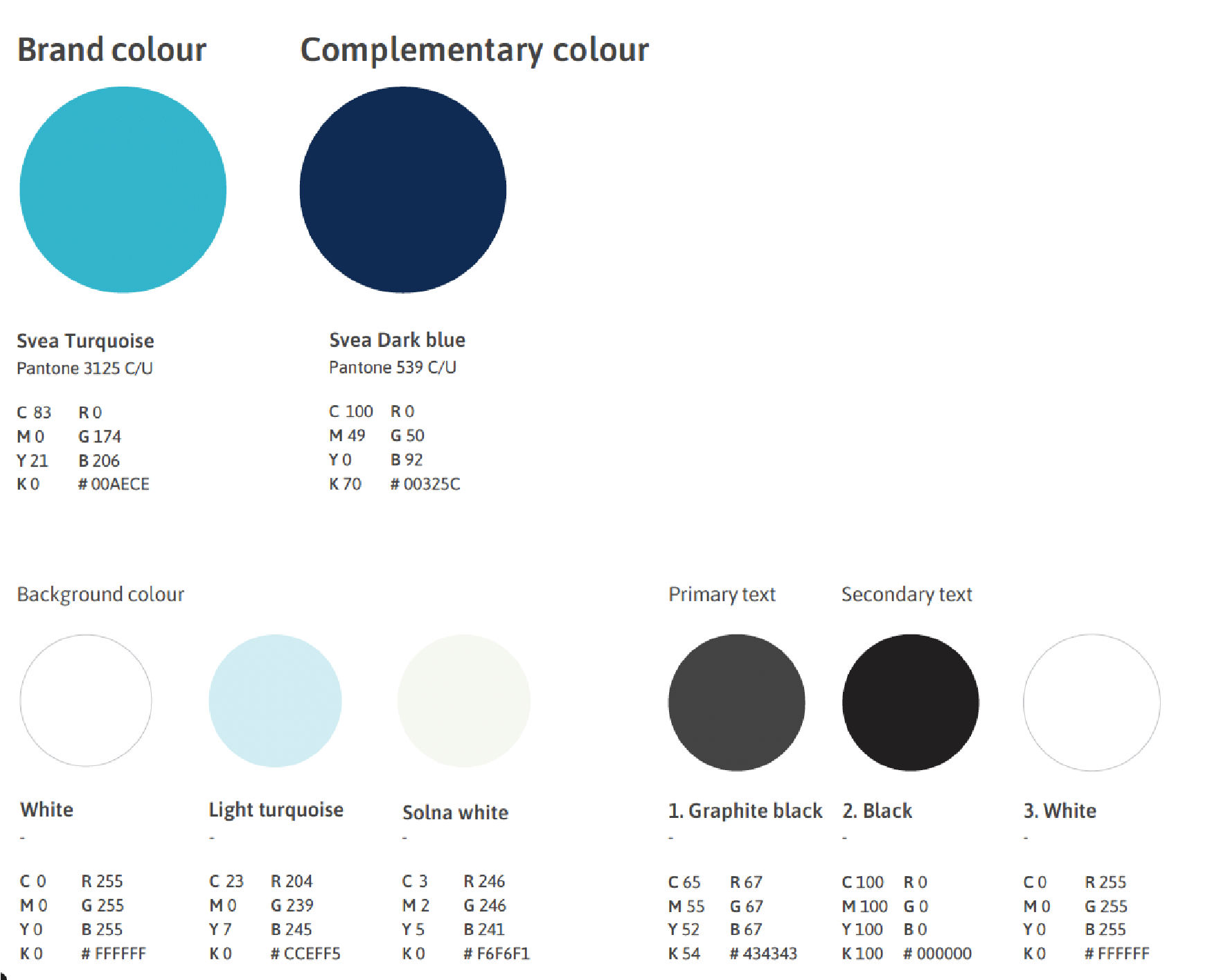 Image Modified
Fonts
Our primary font is Asap.
Tone of Voice
We always write copy that speaks directly to the reader; this encourages dialogue and shows them that they are meaningful to us. We use active voice to give our texts better flow and impact. And we choose words the readers themselves would use in a normal conversation – this prevents our content from becoming too bureaucratic. Above all, text written by us at Svea should always feel friendly, genuine, and trustworthy.
In example we would say “How do you want to pay?” instead of “Select payment method”.
Skip to contents in this page
| Table of Contents |
|---|